Jetpack Compose(2) —— 入门实践
一、项目中使用 Jetpack Compose
从此节开始,为方便起见,如无特殊说明,Compose 均指代 Jetpack Compose。 开发工具: Android Studio
1.1 创建支持 Compose 新应用
新版 Android Studio 默认创建新项目即为 Compose 项目。
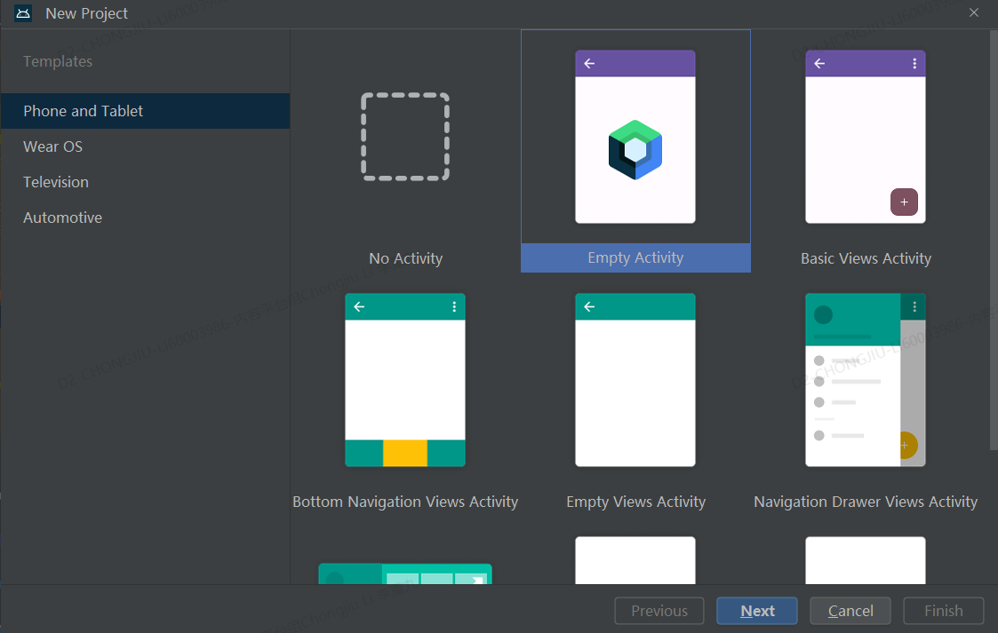
注意:在 Language 下拉菜单中,Kotlin 是唯一可用的选项,因为 Jetpack Compose 仅适用于使用 Kotlin 编写的类。 在 Minimum API level dropdown 菜单中,选择 API 级别 21 或更高级别。
1.2 为现有应用设置 Compose
如果要在现有项目中使用 Compose,只需要将以下定义添加到应用的 build.gradle 文件中:
1
2
3
4
5
6
7
8
9
android {
    buildFeatures {
        compose = true
    }

    composeOptions {
        kotlinCompilerExtensionVersion = "1.5.9"
    }
}
- 在
Android BuildFeatures代码块内将compose标志设置为true会启用 Compose 功能。 ComposeOptions代码块中定义的 Kotlin 编译器扩展版本控制与 Kotlin 版本控制相关联。请参阅兼容性对应图,并选择与项目的 Kotlin 版本匹配的库版本。
1.3 添加依赖
1
2
3
4
5
6
7
8
9
10
11
12
13
14
15
16
17
18
19
20
21
22
23
24
25
26
27
28
29
30
31
32
33
34
35
36
37
38
39
40
41
42
43
dependencies {

    val composeBom = platform("androidx.compose:compose-bom:2024.02.01")
    implementation(composeBom)
    androidTestImplementation(composeBom)

    // Choose one of the following:
    // Material Design 3
    implementation("androidx.compose.material3:material3")
    // or Material Design 2
    implementation("androidx.compose.material:material")
    // or skip Material Design and build directly on top of foundational components
    implementation("androidx.compose.foundation:foundation")
    // or only import the main APIs for the underlying toolkit systems,
    // such as input and measurement/layout
    implementation("androidx.compose.ui:ui")

    // Android Studio Preview support
    implementation("androidx.compose.ui:ui-tooling-preview")
    debugImplementation("androidx.compose.ui:ui-tooling")

    // UI Tests
    androidTestImplementation("androidx.compose.ui:ui-test-junit4")
    debugImplementation("androidx.compose.ui:ui-test-manifest")

    // Optional - Included automatically by material, only add when you need
    // the icons but not the material library (e.g. when using Material3 or a
    // custom design system based on Foundation)
    implementation("androidx.compose.material:material-icons-core")
    // Optional - Add full set of material icons
    implementation("androidx.compose.material:material-icons-extended")
    // Optional - Add window size utils
    implementation("androidx.compose.material3:material3-window-size-class")

    // Optional - Integration with activities
    implementation("androidx.activity:activity-compose:1.8.2")
    // Optional - Integration with ViewModels
    implementation("androidx.lifecycle:lifecycle-viewmodel-compose:2.6.1")
    // Optional - Integration with LiveData
    implementation("androidx.compose.runtime:runtime-livedata")
    // Optional - Integration with RxJava
    implementation("androidx.compose.runtime:runtime-rxjava2")
}
我们看一下新建的项目中,自动生成的 Activity 的代码如下:
1
2
3
4
5
6
7
8
9
10
11
12
13
14
15
16
17
18
19
20
21
22
23
24
25
26
27
28
29
30
31
class MainActivity : ComponentActivity() {
    override fun onCreate(savedInstanceState: Bundle?) {
        super.onCreate(savedInstanceState)
        setContent {
            FirstComposeDemoTheme {
                // A surface container using the 'background' color from the theme
                Surface(
                    modifier = Modifier.fillMaxSize(),
                    color = MaterialTheme.colorScheme.background
                ) {
                    Greeting("Android")
                }
            }
        }
    }
}

@Composable
fun Greeting(name: String) {
    Text(
        text = "Hello $name!"
    )
}

@Preview(showBackground = true)
@Composable
fun GreetingPreview() {
    FirstComposeDemoTheme {
        Greeting("Android")
    }
}
二、 Compose API 设计原则
2.1 一切皆为函数
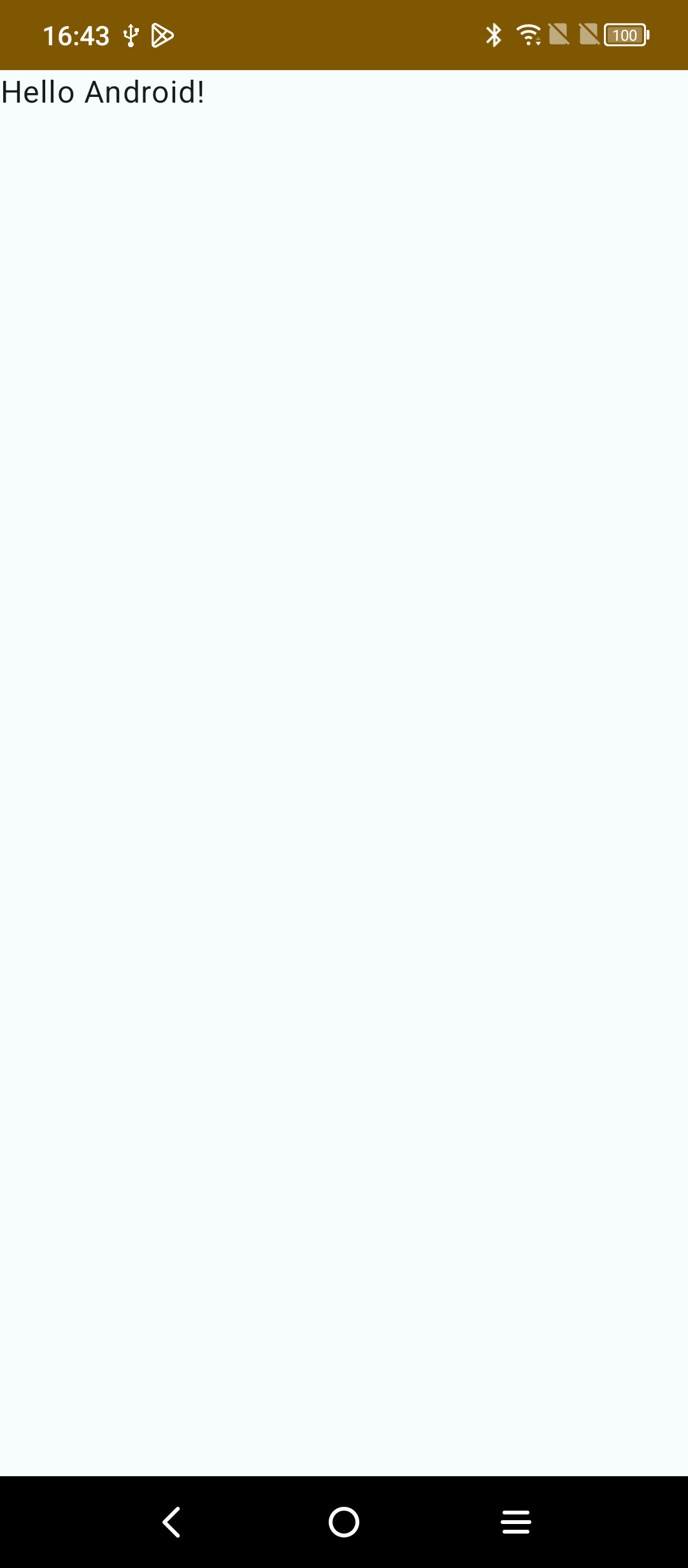
Compose 声明式 UI 的基础是 Composable 函数,使用 Compose, 需要通过定义一组接收数据而渲染界面元素的可组合函数来构建界面。 看上面的最简单的示例:Greeting widget, 它接收一个 String 并渲染出一个显示问候消息的 Text widget。
1
2
3
4
@Composable
fun Greeting(name: String) {
    Text("Hello, $name")
}
运行效果如下:
对于需要渲染成界面的函数,称之为可组合函数,有一下特点:
- 此函数带有
@Composable注释,表明它是一个可组合函数,所有可组合函数都必须带有此注释。 - 可组合函数需要在其它可组合函数的作用域内被调用。
- 为了与普通函数区分,约定可组合函数首字母大写。
代码中还有一个,带有 @Preview 注解的 Composable 函数,顾名思义,该函数用来实时预览效果的。点击 design 选项,可看到预览的样式。Compose 强大的预览功能,大家可以自行探索。
我们自定义 Greeting 组件,里面实际上包含了一个 Text 组件, 点击跳转到 Text:
1
2
3
4
5
6
7
8
9
10
11
12
13
14
15
16
17
18
19
20
21
@Composable
fun Text(
    text: String,
    modifier: Modifier = Modifier,
    color: Color = Color.Unspecified,
    fontSize: TextUnit = TextUnit.Unspecified,
    fontStyle: FontStyle? = null,
    fontWeight: FontWeight? = null,
    fontFamily: FontFamily? = null,
    letterSpacing: TextUnit = TextUnit.Unspecified,
    textDecoration: TextDecoration? = null,
    textAlign: TextAlign? = null,
    lineHeight: TextUnit = TextUnit.Unspecified,
    overflow: TextOverflow = TextOverflow.Clip,
    softWrap: Boolean = true,
    maxLines: Int = Int.MAX_VALUE,
    onTextLayout: (TextLayoutResult) -> Unit = {},
    style: TextStyle = LocalTextStyle.current
) {
    // ...
}
可见框架提供的 Text 组件也是一个 Composable 函数。
Composable 函数通过多级嵌套形成结构化的函数调用链,函数调用链经过运行后生成 UI 一棵视图树。视图树一旦生成便不可随意改变,视图树的刷新依靠 Composable 函数的反复执行来实现,当需要显示的数据发生变化时,Composable 基于新的参数再次执行,更新底层的视图树。最终完成视图的刷新。 这个通过反复执更新视图树的过程称之为重组。后面的文章再详细介绍重组。
在 Compose 中,一切组件都是顶层函数,没有类的概念,自然也不会有任何的继承结构。
2.2 组合优于继承
看一个常用控件,按钮。
1
2
3
4
5
6
7
8
9
10
11
12
13
...
Surface(
    modifier = Modifier.fillMaxSize(),
    color = MaterialTheme.colorScheme.background
) {
    Column {
        Greeting("Android")
        Button(onClick = { /*TODO*/ }) {

        }
    }
}
...
为了方便演示,我这里增加了一个 Column 组件,相当于传统 View 视图中的垂直方向的线性布局。然后在里面增加了一个 Button 组件。
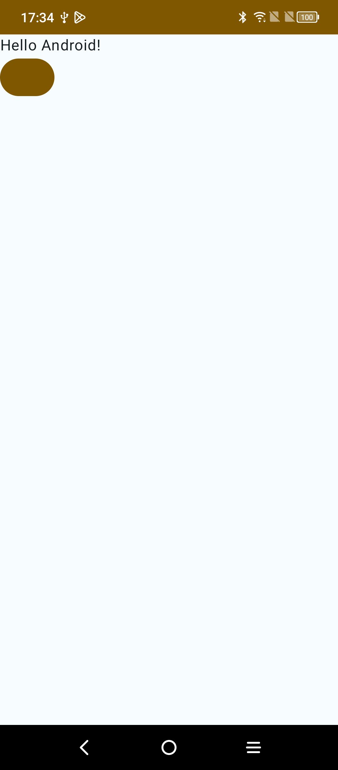
效果如上图,界面上多了一个按钮,我们没有设置 button 的颜色,它却默认与当前系统主题颜色适应了。点击,还能看到水波纹效果。这是因为我们使用的 Button 组件来自 Google material3 包里面,自动适配了这些。由于我们没有给按钮设置文本,所以按钮上并没有文字显示。那如 何给按钮添加文本呢?
1
2
3
4
5
6
7
8
9
10
11
12
13
14
15
@Composable
fun Button(
    onClick: () -> Unit,
    modifier: Modifier = Modifier,
    enabled: Boolean = true,
    shape: Shape = ButtonDefaults.shape,
    colors: ButtonColors = ButtonDefaults.buttonColors(),
    elevation: ButtonElevation? = ButtonDefaults.buttonElevation(),
    border: BorderStroke? = null,
    contentPadding: PaddingValues = ButtonDefaults.ContentPadding,
    interactionSource: MutableInteractionSource = remember { MutableInteractionSource() },
    content: @Composable RowScope.() -> Unit
) {
    // ...
}
我们跳转到 Button 的源码,却并没有发现类似 Text 组件一样的 text 参数。也就是说,我们并不能通过设置参数的方式,给 Button 组件设置文本,那要怎么做? 从源码我们看到,有两个参数是没有默认值的,需要我们调用时传入。一个是 onClick, 这里我们传入了一个空的 lambda 表达式,另一个没有默认值的参数 content,类型是 @Composable RowScope.() -> Unit,其实是要求传入一个 Composable ,并且,它提供的作用域是 RowScope。看代码就明白了:
1
2
3
4
5
6
7
8
...
Column {
    Greeting("Android")
    Button(onClick = { /*TODO*/ }) {
        Text("I'm a button")
    }
}
...
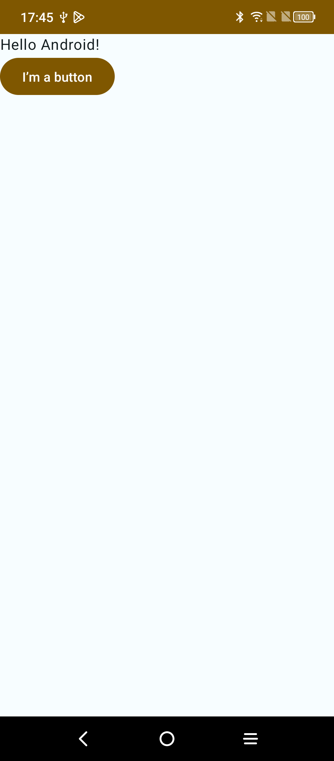
我们成功给 Button 组件添加上了文字,不是通过参数的形式设置的,二是将一个 Button 组件和一个 Text 组件组合起来,形成了一个带有文本的按钮。仔细想一下,这样的设计是否更合理,Button 本身的作用就是提供点击时间,Text 提供文本作用的。从设计模式的角度来讲,各个组件职责更单一。也变面出现了上文中提到的 “带有剪贴板功能的按钮” 这种问题。
这也是为什么说组合优于继承。
2.3 单一数据源
单一数据源是包括 Compose 在内的所有声明式 UI 框架的一个重要原则。 回想传统 View 视图中的 EditText 控件。它的文本变化可能来自用用户的输入,也可能来自代码某处的 setText。这种多数据源在状态变化的情况下不容易跟踪,且状态源过度分散,会增加状态同步的工作量,比如 EditText 内部持有一个 mText 状态,其它组件需要监听它的状态变化,同时,它还有可能需要监听其它组件的状态变化。 我们再看看在 Compose 中,是如何实现 EditText 的效果的。
Compose 提供了 TextField 作为常用的文本输入框。它也遵循 Meterial Design 设计准则。看看它最简单的使用方式:
1
2
3
4
5
6
7
8
9
10
11
Column {
    Greeting("Android")
    Button(onClick = { /*TODO*/ }) {
        Text("I’m a button")
    }

    var text by remember { mutableStateOf("文本框初始值") }
    TextField(value = text, onValueChange = {
        text = it
    })
}
效果如下:
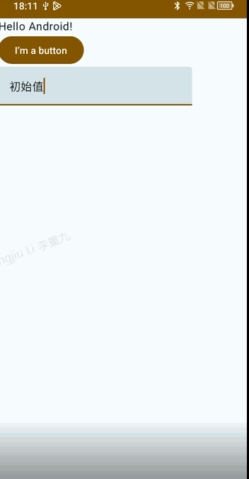
这里出现了关于 State 的使用,关于状态,将在下一篇文章中讲解,这里只需要知道,TextField 的参数 value 是唯一能决定其显示文本的数据源。我们定义了一个状态变量 text, 并设置给了 value 参数。如果给 value 传入一个固定的字符串,则无论在键盘上输入什么,TextField 的显示都不会改变。onValueChange 参数这个回到中,可以获取到当前来自软键盘的最新输入。我们利用这个信息来更新可变状态 text, 驱动界面刷新来显示最新的输入文本。
三、Compose 与 View 互操作
Compose 生成的 UI 树节点是 LayoutNode, View 生成的 UI 树节点是 View 和 ViewGroup, 两者之间可以共存与一棵树中,就像 DOM 节点可以依靠 Webview 挂载到 View 树一样, Compose 与 View 之间也存在这样的桥梁,使得两者可以共同存在。
3.1 Compose 中使用 View
什么时候会在 Compose 中使用 View 呢?
- 极少数 View 暂时还没有 Compose 版本,比如 MapView, WebView
- 有一块之前写好的 UI, (暂时或者永远)不想动,想直接拿过来用
- 初学者用 Compose 实现不了想要的效果,先用 View
3.1.1 Compose 中使用 AndroidView
看例子:
1
2
3
4
5
6
7
8
9
10
11
12
13
@Composable
fun MyTextView(text: String) {
    AndroidView(
        fatory = { context ->
            TextView(context).apply {
                setText(text)
            }
        },
        update = { view ->
            view.setText(text)
        }
    )
}
这个桥梁是 AndroidView, 它是一个 Composable 函数。
1
2
3
4
5
6
@Composable
fun <T: View> AndroidView(
    fatory: (context) -> T,
    modifier: Modifier = Modifier,
    update: (T) -> Unit = NoOpUpdate
)
fatory 接收一个 Context 参数,用来构建一个 View, update 方法是一个 callback, inflate 之后会执行,读取的状态 state 值变化后,也会被执行。
3.1.2 Compose 中使用 xml 布局
上面使用 AndroidView 适用于少量的 UI, 如果需要复用一个已经存在的 xml 布局,怎么办?
- 首先开启 viewBinding
1
2
3
4
5
6
android {
    buildFeatures {
        compose = true
        viewbinding = true
    }
}
- 添加 Compose viewbinding 依赖
1
implementation("androidx.compose.ui:ui-viewbinding:1.5.4")
使用过 ViewBinding 的同学应该清楚,build 之后,会根据 xml 文件生成对应的 Binding 类,例如 TestLayoutBinding
1
2
3
4
5
6
7
8
@Composable
fun TestComposableLayout() {
    AndroidViewBinding(TestLayoutBinding::inflate) {
        testButton.setOnClickListener {
            //...
        }
    }
}
其实 AndroidViewBinding 内部还是调用了 AndroidView 这个 Composable 函数。
3.2 View 中使用 Compose
使用 ComposeView 作为桥梁。 普通 xml 文件中加入 ComposeView
1
2
3
4
5
6
7
8
9
10
11
12
13
14
15
<?xml version="1.0" encoding="utf-8"?>
<LinearLayout xmlns:android="http://schemas.android.com.apk/res/android"
    android:layout_width="match_parent"
    android:layout_height="match_parent"
    android:orientation="vertical">
    <TextView id="@+id/tv_test"
        android:layout_width="wrap_content"
        android:layout_height="wrap_content"
        android:text="test" />

    <androidx.compose.ui.platform.ComposeView
        android:id="@+id/compose_view"
        android:layout_width="match_parent"
        android:layout_height="match_parent" />
</LinearLayout>
代码中,先根据 id 查找出来,再 setContent 即可:
1
2
3
findViewById<ComposeView>(R.id.compose_view).setContent {
    Text("I'm Composable")
}
动态添加也可:
1
2
3
4
5
addView(ComposeView(this@MainActivity).apply {
    setContent {
        Text("I'm Composable")
    }
})
这里起到桥梁作用的 ComposeView, 本质上是一个 ViewGroup, 它的 setContent() 方法开启了 Compose 世界的大门,在这里可以传入 Composable 函数。
小结:
- Compose 中调用 View, 借助 AndroidView
- View 中调用 Compose,借助 ComposeView
- Compose 和 View 的互操作性也保证了项目可以逐步迁移。